
Antarctica is a place to live and work.
The watch
DDU is a weather observation and forecasting station. We produce two weather forecasts a da y: a meteogram in the morning and a bulletin in the evening. I describe the watch day in a podcast (in French).
The watch is a lot of time, but not a lot of production. The real job is to adapt to the station needs.
Sea state
Basically, weather forecasting isn’t at all like in mainland France: we write it on the spot for the people we see every day.
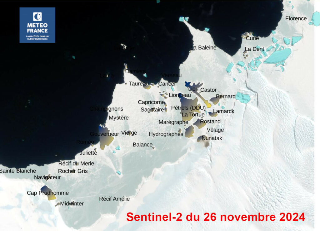
The first request I had was to modify the swell forecast… I was already monitoring sea ice. To do this, I was monitoring the swell, which has the bad taste of breaking up the pack ice by satellite image.
But in summer, when there’s no more ice, Célestin, who drives a small boat, wanted me to provide him with wave heights in Pointe Géodésie. I adapted to Célestin’s observations an empirical formula for wave height like this one:
- où,
– height of fully formed waves
– dimensionless coefficient approximately equal to 0.27
– wind speed
– acceleration of gravity.
On this occasion, I was able to take a boat tour.
Animation and Participatory Weather
Weather is a subject that interests people. So it’s fun to popularize. That’s what I did on Jeudi de la connaissance. I had dozens of people launch the radiosonde balloon, but I also had them write forecast bulletins and state the radio bulletin.
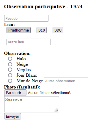
To have more interaction with users and to retrieve observation information, I coded a participatory meteorology tool (php and javascript) during the 2023-2024 summer campaign. All winterers can now fill in an observation form on the base’s intranet (accessible on cell phones). They can attach a photo, a comment or a question. Observations and photos are sent by e-mail from the DDU weather station.
Data supply
There isn’t a single activity at the base that isn’t weather-sensitive. That’s why weather data is so important.
At DDU, we collect data on temperature, humidity, wind, radiation and sensitive weather (visibility, precipitation) in a local database. Some of this data is then sent to meteorological databases in mainland France.
We didn’t have a simple tool for visualizing this data on site. A search of the station’s archives revealed that this was a handicap that successive agents had tried to resolve by reinventing the wheel with each generation.
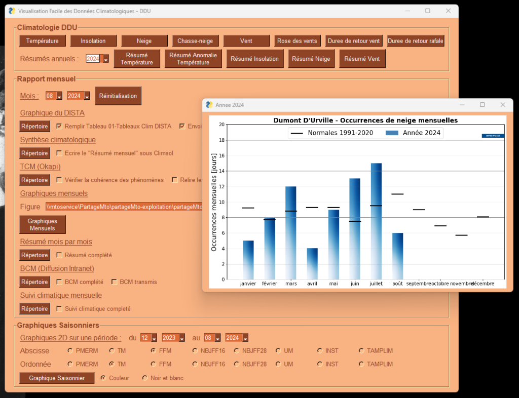
I used Python scripts from previous missions, adapted and formatted in visualization software with FreeSimpleGUI. First the minute data, then the hourly data. This is VisuDDU.

Similarly, climate data have been standard on DDU for 3 years. There is climatology data (1991-2020 averages). Each month’s climatology comparisons. Then the production of graphs for monthly climatology reports and comparisons between years over a given period. This is ClimDDU.
Automatic file filling
At the station, we monitor certain indicators on a daily basis. At the start of my mission, we entered daily fields such as minimum and maximum temperatures, swell periods and amplitude, maximum wind speed, etc. by hand in different files. Similarly, we entered radiosonde values in a dedicated file. In all, we entered around fifty values by hand, passing these figures from one computer (with the databases) to another (with the freeoffice sheets). Stupid!
I wrote Python programs to fill in these fields from messages sent automatically to the libreoffice files.
I have put these codes on Météo France’s GitLab, so that we don’t lose them.